
Listen to this Post
Introduction
Samsung is once again preparing to refresh its iconic smartphone experience. After the colorful gradients of One UI 7.0 and the stability-focused One UI 8.0, the tech giant is now pushing toward a more three-dimensional visual style with One UI 8.5. Leaks suggest that Samsung is experimenting with shadows, curves, and sleeker layouts to give its interface a more modern, polished look. Paired with upcoming devices like the Galaxy S25 FE, Galaxy S25 Ultra, and Galaxy Z Fold 7, this update could redefine how millions of users interact with their phones daily.
One UI 8.5: Everything You Need to Know
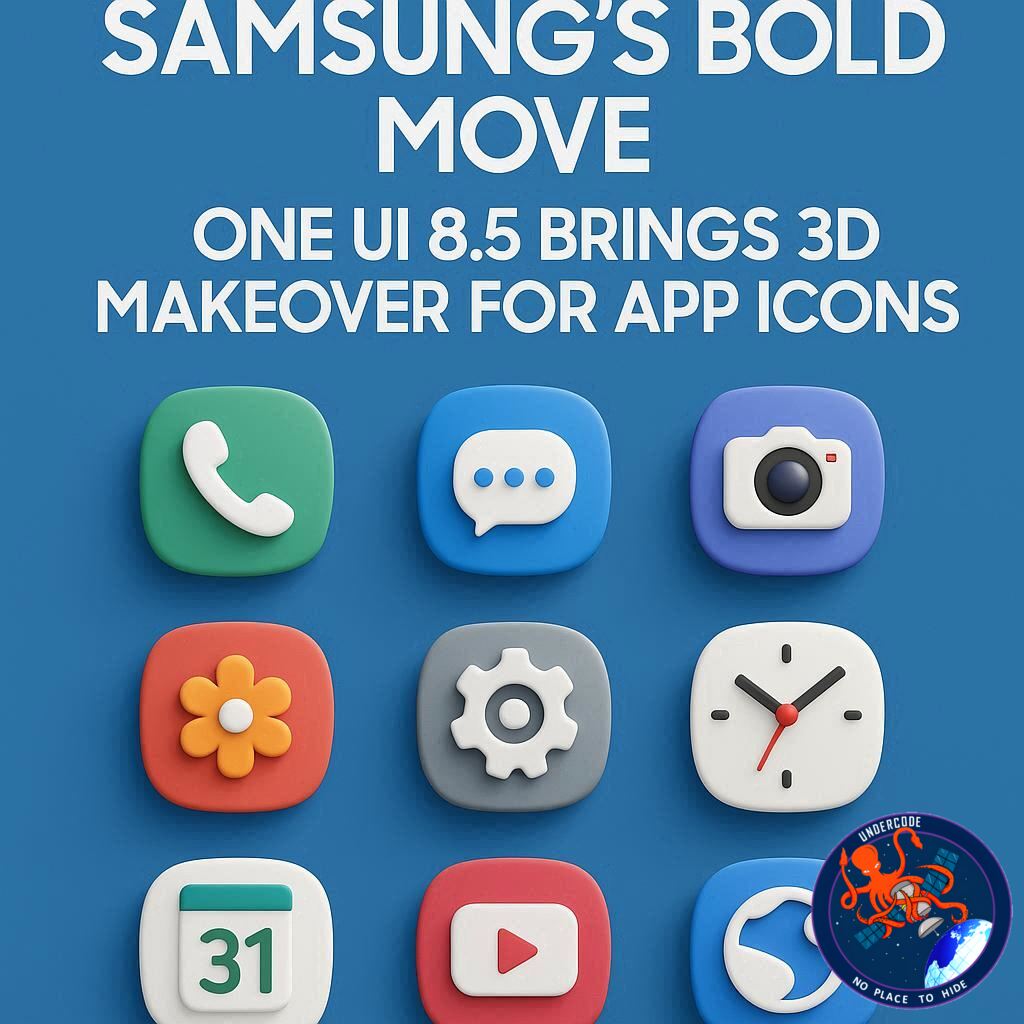
Samsung introduced fresh gradient colors in One UI 7.0, which gave stock app icons a vibrant, modern appeal. But One UI 8.0 played it safe, leaving the icon designs largely unchanged. Now, leaked builds of One UI 8.5 show that Samsung is shifting toward a three-dimensional icon style.
Instead of flat visuals, icons appear more dynamic, with shadows and subtle curves making them pop off the screen. Interestingly, this isn’t just limited to stock apps — third-party app icons are also showing the same transformation in early builds. However, since this is still a work-in-progress, it’s uncertain whether Samsung will commit fully to this design before launch.
Alongside icons, Samsung is reworking its stock app layouts. The company is introducing a pill-shaped bottom navigation bar, moving away from the text labels that appeared in One UI 7.0. The result? A cleaner, more minimalist experience.
The upcoming Galaxy S26 series, expected in early 2026, will be the first to ship with One UI 8.5 pre-installed. Until then, fans can look forward to testing it once Samsung rolls out beta builds.
What Undercode Say: 🔍
The Evolution of Samsung’s Design Language
Samsung’s design philosophy has always been about balancing innovation with familiarity. With One UI 8.5, the company seems to be borrowing cues from Apple’s iOS glossy icons of the past, but with a modern twist that blends gradients, depth, and minimalism. This signals Samsung’s intent to make its interface visually immersive while remaining user-friendly.
Why the 3D Look Matters
Design may seem like a cosmetic update, but it plays a huge role in user engagement and brand perception. Three-dimensional icons stand out better on high-resolution AMOLED displays, creating a sense of depth that flat icons often fail to deliver. This could also help differentiate Samsung from competitors like Google’s Material You, which leans heavily on flat, pastel aesthetics.
Impact on Developers and Third-Party Apps
If Samsung applies the 3D effect universally, developers might have to rethink their own icon designs to match the updated look. This could lead to a more unified ecosystem of app visuals, giving Samsung’s interface a cohesive premium feel.
Market Timing and Strategy
Releasing One UI 8.5 alongside the Galaxy S26 lineup is a strategic move. Software updates tied to flagship devices often boost upgrade cycles, nudging long-time users toward newer models. Samsung’s aggressive design revamp can also spark renewed hype, especially in markets where visual appeal sells as much as performance.
Undercode’s Key Takeaways
Samsung is moving toward depth-driven UI design, making icons and apps feel more tactile.
The removal of text labels points to a streamlined, more intuitive navigation style.
This redesign could increase user retention, as visual freshness plays into long-term satisfaction.
The move places Samsung in direct competition with Apple’s polished design ecosystem, while still keeping its Android roots intact.
Fact Checker Results ✅❌
✅ Leaks confirm One UI 8.5 includes 3D-style icons and a redesigned navigation bar.
✅ Release timeline points to early 2026 with the Galaxy S26 series.
❌ Not all icons may adopt the new design — early builds show inconsistencies.
Prediction 🔮
Samsung’s One UI 8.5 will likely set the stage for a major design shift in Android interfaces. Expect competing brands to follow suit, experimenting with 3D and depth-driven UI aesthetics. If Samsung fully commits, this could spark a trend toward hyper-realistic mobile interfaces, blending the best of skeuomorphism and modern minimalism. By 2026, users may see a new wave of visually rich yet functional smartphone UIs dominating the market.
🕵️📝✔️Let’s dive deep and fact‑check.
References:
Reported By: www.sammobile.com
Extra Source Hub:
https://www.instagram.com
Wikipedia
OpenAi & Undercode AI
Image Source:
Unsplash
Undercode AI DI v2
🔐JOIN OUR CYBER WORLD [ CVE News • HackMonitor • UndercodeNews ]
📢 Follow UndercodeNews & Stay Tuned:
𝕏 formerly Twitter 🐦 | @ Threads | 🔗 Linkedin | 🦋BlueSky | 🐘Mastodon


