
Listen to this Post
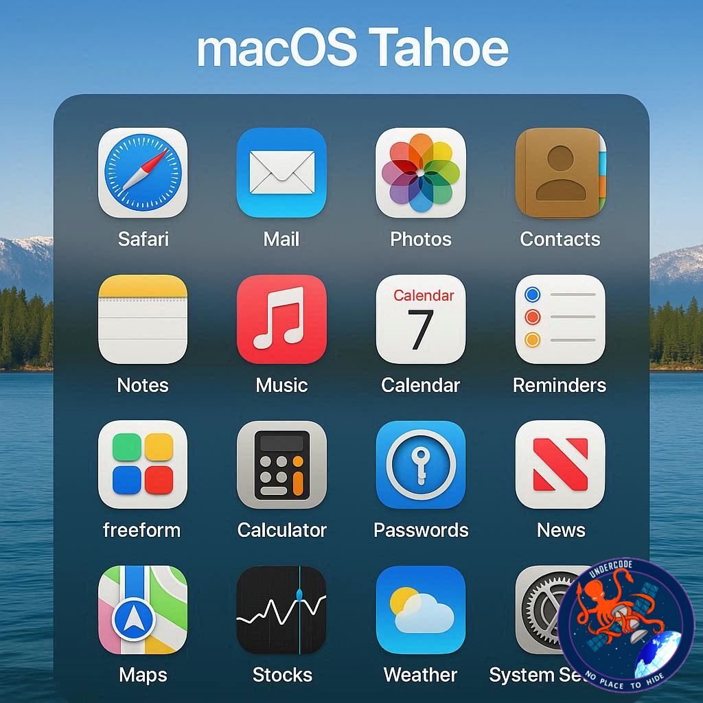
A Fresh Shift in macOS Experience
Apple has always been known for daring changes, sometimes controversial, but often transformative. With macOS Tahoe, one such bold move has captured attention — the removal of the beloved Launchpad. For over a decade, Launchpad was seen as a staple of macOS, offering a grid-like app launcher reminiscent of iOS. But now, it’s gone, replaced by a new Apps window that lives in the Dock. Instead of a full-screen interface, users get a compact, searchable, and customizable hub for all their applications. While nostalgic users may feel a pang of loss, many are realizing that this redesign is not just change for the sake of change, but an overdue upgrade that improves usability and efficiency.
A Farewell to Launchpad’s Familiarity
For years, Launchpad carried a sense of familiarity and simplicity. It mimicked the iPhone home screen and brought that same grid layout to the Mac. Yet beneath its iconic look were long-standing problems that made it less practical over time. Launchpad often jumbled app organization, leaving users swiping endlessly across screens to find a single app. The lack of alphabetical sorting or proper categorization meant clutter grew quickly. Worse still, the full-screen design, once tolerable on smaller laptops, became increasingly frustrating on larger displays where scanning edge to edge felt like playing digital ping-pong.
Why the Old System Felt Outdated
Despite its charm, Launchpad was riddled with inefficiencies. Apps were spaced too far apart, making multiple swipes necessary. Manual rearranging was tedious and unsustainable for users with dozens or even hundreds of apps. Even its search bar — hidden and tiny at the top — failed to offer intuitive access. It was clear to many that Apple needed to modernize the launcher experience. In hindsight, Launchpad wasn’t aging gracefully; it was stagnating.
The New Apps Window Takes Over
macOS Tahoe introduces a redesigned Apps window that directly addresses these shortcomings. Applications are now organized alphabetically by default, ensuring that finding what you need is instant. Frequently used apps intelligently float to the top, creating a dynamic and personalized system that adapts to usage patterns. Categories like Productivity, Utilities, and Entertainment add structure, while customization options allow switching between grid and list views. Users can also toggle the display of iPhone apps, providing more control than Launchpad ever did.
A Search System That Finally Works
Search is now central to the new interface. A large, prominent search bar crowns the Apps window, making it faster and more intuitive. Unlike Launchpad’s buried feature, this design puts search front and center. Even better, integration with Spotlight means users can fluidly switch between app browsing and deeper system-wide search functions. This tight connection creates a seamless workflow, reducing friction and making the Mac feel more cohesive.
Why This Overhaul Matters
Change in Apple’s ecosystem often sparks debate, and Launchpad’s removal is no exception. Yet, the Apps window feels like a thoughtful evolution rather than an arbitrary replacement. It offers structure, speed, and flexibility — qualities that modern macOS users demand. While some may miss the iconic grid, Apple’s design language is clearly moving toward functional minimalism, emphasizing usability over nostalgia.
What Undercode Say:
Apple’s decision to kill off Launchpad in macOS Tahoe is a fascinating case study in balancing tradition with progress. At its core, this shift highlights Apple’s broader strategy: streamline workflows, reduce redundancy, and make macOS feel more aligned with the needs of professionals and power users.
Launchpad was symbolic but flawed. Its charm came from its resemblance to iOS, yet that was also its weakness. By trying to replicate a mobile experience on a desktop, Apple inadvertently limited its practicality. A system designed for a 5-inch screen doesn’t scale gracefully to a 27-inch iMac. Tahoe’s Apps window corrects that by embracing desktop-first logic instead of clinging to mobile mimicry.
From a usability perspective, the alphabetical sorting alone is a game-changer. Human memory often relies on associative recall — we don’t just remember where an app sits, we remember its name. Launchpad ignored this, forcing users to navigate visually, which slowed down workflows. The new design respects cognitive patterns, making interaction smoother and faster.
The inclusion of tabs and filters also reflects Apple’s recognition that apps are no longer just apps — they are part of larger workflows. By offering categories, Apple is essentially nudging users toward better organization, while still giving them the freedom to customize. This flexibility is vital in a professional environment where users juggle productivity tools, entertainment apps, and system utilities daily.
The larger search box is not just a cosmetic upgrade. It symbolizes Apple’s push toward search-first computing, where typing becomes as natural as clicking. With Spotlight gaining more AI-driven features, the Apps window is no longer just a launcher — it’s a gateway into a smarter, predictive macOS. This creates synergy between app discovery and broader system intelligence.
Still, nostalgia cannot be dismissed. Long-time macOS users who cherished Launchpad’s simplicity may resist the change, especially those who valued its visual grid for quick recognition. Apple, however, has rarely been afraid to disrupt habits. From removing the headphone jack to rethinking keyboards, Apple thrives on forcing adaptation. Tahoe’s move continues that legacy.
What this really signals is a deeper philosophical stance: Apple prioritizes efficiency over sentimentality. The company recognizes that software must evolve alongside hardware and user expectations. As Macs grow more powerful and versatile, the tools to navigate them must match that evolution.
In essence, macOS Tahoe’s Apps window is not just a replacement — it’s a redefinition of how Mac users interact with their digital ecosystem. It takes the chaos of Launchpad and replaces it with clarity, speed, and intelligence. That’s not a loss; it’s progress.
Fact Checker Results
✅ Launchpad has indeed been removed in macOS Tahoe.
✅ Apps window includes alphabetical sorting, categories, and improved search.
❌ Claims that Launchpad was “perfectly fine” ignore its long-standing inefficiencies.
Prediction
Looking ahead, Apple will likely expand the Apps window with AI-powered app recommendations, tighter integration with iOS, and smarter categorization. This evolution suggests that macOS is heading toward a future where personalization and predictive intelligence become the backbone of navigation. The Apps window may start simple, but it’s poised to become one of the most powerful hubs in Apple’s desktop ecosystem.
🕵️📝✔️Let’s dive deep and fact‑check.
References:
Reported By: www.techradar.com
Extra Source Hub:
https://www.twitter.com
Wikipedia
OpenAi & Undercode AI
Image Source:
Unsplash
Undercode AI DI v2
🔐JOIN OUR CYBER WORLD [ CVE News • HackMonitor • UndercodeNews ]
📢 Follow UndercodeNews & Stay Tuned:
𝕏 formerly Twitter 🐦 | @ Threads | 🔗 Linkedin | 🦋BlueSky | 🐘Mastodon


