
Listen to this Post
Introduction
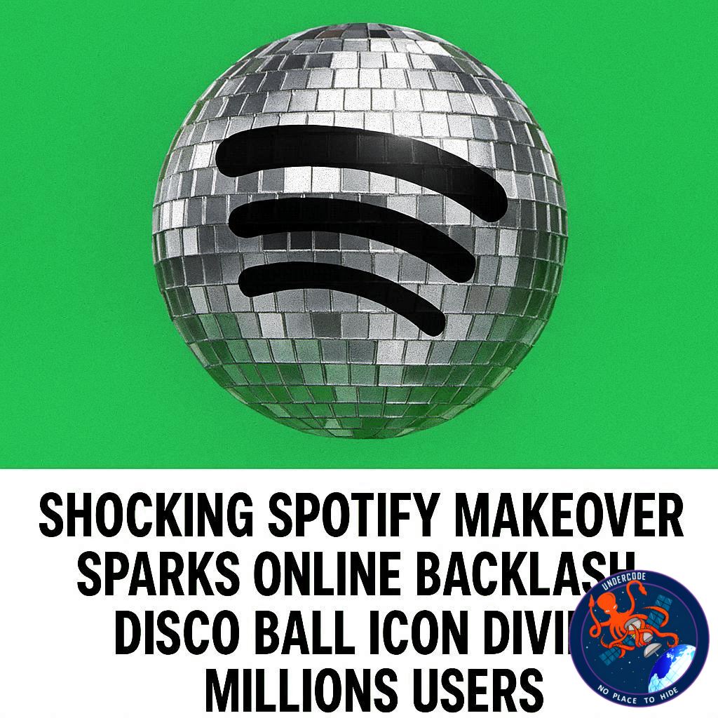
Spotify’s 20th anniversary celebration took an unexpected turn when the company rolled out a bold redesign of its mobile app icon, replacing the familiar flat green logo with a flashy, photorealistic disco ball. What was intended as a lighthearted tribute to two decades of music streaming quickly turned into a heated debate across social media platforms. While some users embraced the nostalgic party aesthetic, others were confused or even frustrated by the sudden visual shift. The controversy highlights how deeply users connect with digital design identity, especially when it comes to everyday apps that shape their phone experience.
Original Summary
Spotify recently updated its mobile app icon as part of its 20th anniversary celebration, replacing the classic flat green logo with a photorealistic disco ball design. The company intended the change to be a fun, temporary, and celebratory gesture rather than a permanent redesign. However, many users misunderstood the intention and assumed the new icon was permanent, leading to confusion and criticism across social media. Spotify responded by clarifying that the disco ball icon is only temporary and will revert to the original design within the week. The company actively addressed concerns online to reassure users that the classic green branding would return. While some users appreciated the playful and festive approach, others felt the design clashed with their carefully curated home screen aesthetics. The situation also sparked discussion about how sensitive users are to app icon changes and how even small visual updates can trigger strong reactions. Some argued that Spotify should allow optional icon customization instead of forcing a temporary change on everyone. Others compared the move to similar campaigns by apps like Instagram, which previously introduced limited-time icon variations for promotional purposes. Despite mixed reactions, many acknowledged the effort behind celebrating a milestone anniversary in a creative way. Ultimately, Spotify confirmed that the disco ball icon was only part of a short-lived celebration and not a permanent rebrand.
What Undercode Say:
The Spotify disco ball incident reveals a deeper tension between corporate branding strategies and user-controlled digital environments. In modern smartphone culture, icons are not just branding tools but emotional anchors tied to personal identity, aesthetic preferences, and even productivity habits. When Spotify replaced its recognizable green icon with a shiny disco ball, it unintentionally disrupted that visual stability, triggering discomfort among users who rely on consistency in their device layouts. The backlash was not necessarily about the design quality itself, but about perceived loss of control over a familiar interface. This reflects a broader trend in tech where users increasingly expect customization options rather than forced visual updates, even temporary ones. Companies like Spotify often use celebratory branding to humanize their image and create emotional engagement, yet such moves can backfire when communication is unclear. The confusion around whether the icon was permanent highlights a gap in messaging strategy, showing how quickly misinformation spreads in social media environments. At the same time, the mixed reactions demonstrate how design nostalgia plays a powerful role in user attachment to legacy interfaces. The green Spotify icon has become a subconscious marker of reliability, and altering it—even briefly—feels disruptive to that mental model. However, from a marketing perspective, the disco ball was a calculated attempt to connect music streaming with party culture and celebration. The failure lies not in creativity but in expectation management. This incident also exposes how Apple’s app ecosystem, despite allowing some icon customization, still leaves limited room for brands to experiment safely. If Spotify had offered the disco ball as an optional theme rather than a forced default, the reaction would likely have been significantly more positive. Ultimately, the situation demonstrates how even small UI experiments can escalate into large-scale user discourse when they intersect with identity, habit, and digital comfort zones.
🔍 Fact Checker Results
🔍 The disco ball icon was confirmed as a temporary Spotify 20th anniversary design.
🔍 Spotify publicly clarified that the original green icon would return shortly.
🔍 User backlash was primarily based on confusion rather than a permanent redesign decision.
📊 Prediction
The most likely outcome is that Spotify will avoid similar forced icon swaps in the future and instead expand optional customization features for users who enjoy themed app icons. Tech companies will likely study this reaction as a case example of how small UI changes can create outsized public response. Future anniversary or promotional campaigns will probably shift toward opt-in visual features rather than system-wide changes, reducing confusion while still allowing creative expression.
🕵️📝Let’s dive deep and fact‑check.
References:
Reported By: 9to5mac.com
Extra Source Hub (Possible Sources for article):
https://stackoverflow.com
Wikipedia
OpenAi & Undercode AI
Image Source:
Unsplash
Undercode AI DI v2
Bing
🔐JOIN OUR CYBER WORLD [ CVE News • HackMonitor • UndercodeNews ]
📢 Follow UndercodeNews & Stay Tuned:
𝕏 formerly Twitter 🐦 | @ Threads | 🔗 Linkedin | 🦋BlueSky | 🐘Mastodon


