
Listen to this Post
A Fresh Chapter for Smartwatch Music Apps
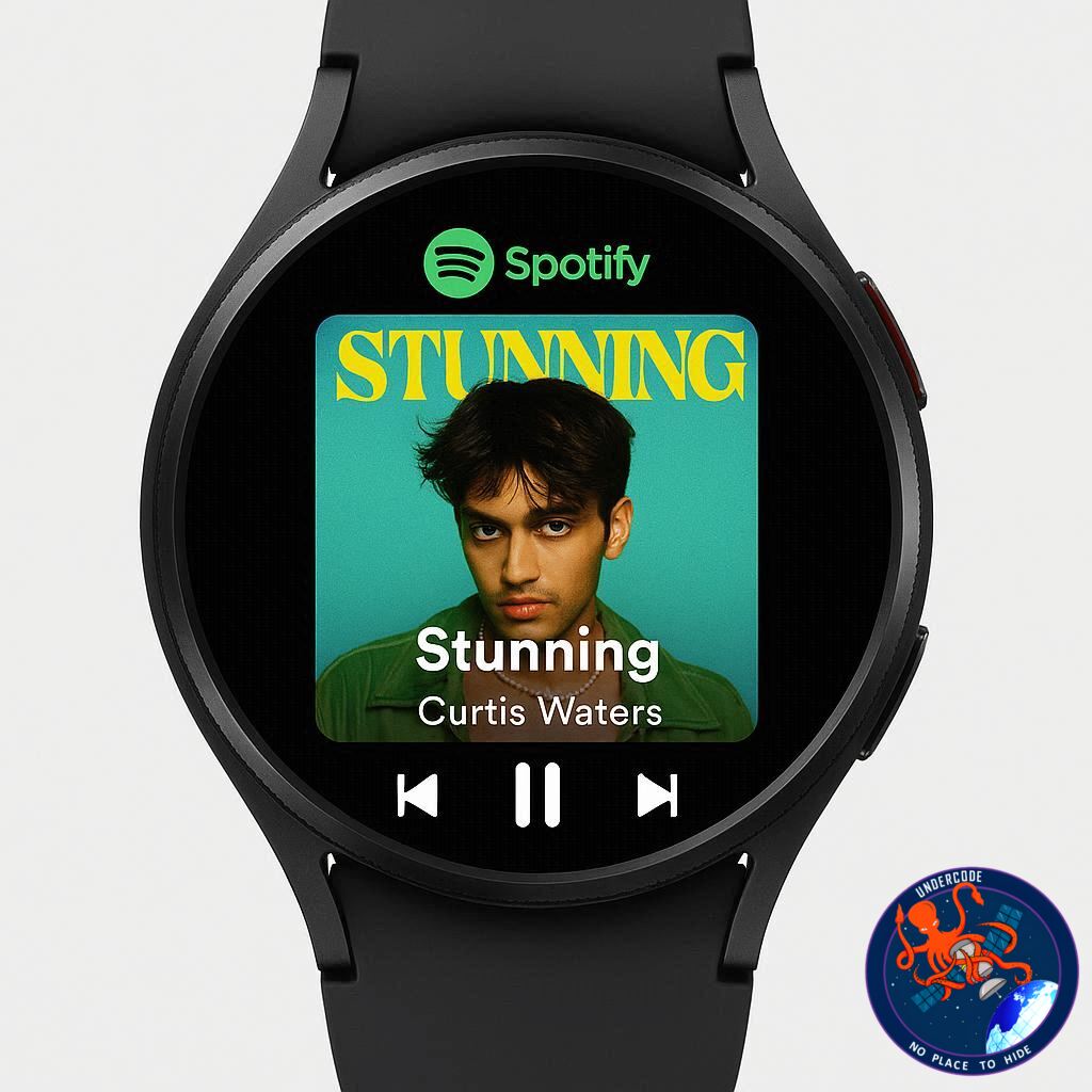
The latest update to Spotify on Wear OS is turning heads, especially among Samsung users. Designed with simplicity and immersion in mind, this redesign introduces a visually striking interface that puts album artwork at the center of the listening experience. For users of devices like the Galaxy Watch, the update delivers a smoother, more intuitive way to interact with music directly from the wrist.
A Visual-First “Now Playing” Experience
At the heart of the update is a completely reimagined “Now Playing” screen. Instead of cluttering the display with controls, Spotify now emphasizes album art in full view. Playback controls are cleverly hidden, allowing users to focus on the music’s visual identity. Despite the minimalism, functionality remains intact—simple gestures like a single tap to play or pause, and double taps to skip or rewind tracks, ensure ease of use without sacrificing aesthetics.
Gesture Controls Replace Traditional Buttons
The new interface leans heavily on gesture-based navigation. A swipe upward reveals traditional playback controls such as play, pause, track skipping, downloads, and audio output options. This layered approach keeps the main screen clean while still offering full control when needed. The design reflects a broader trend in wearable UI—reducing visual clutter while maintaining accessibility.
Streamlined Navigation Across the App
Spotify has also improved how users move through the app. Swiping further leads to the Home view, where shortcuts to search, personal libraries, and recently played playlists are easily accessible. This structure minimizes friction, making it quicker to jump between functions without navigating through multiple menus.
Enhanced Settings and Audio Customization
The update doesn’t just focus on visuals—it also enhances control. Within the Settings section, users can manage downloads, tweak audio quality up to 320kbps, and connect wireless audio devices. This level of customization ensures that even power users can fine-tune their listening experience directly from their smartwatch.
A Smoother, More Responsive Experience
One of the most noticeable improvements is performance. The app feels significantly smoother, with faster transitions and less lag when switching between screens. This refinement suggests that Spotify has optimized the app not just for design, but also for efficiency—an essential factor for wearable devices with limited resources.
A More Organized Library at Your Fingertips
The “Your Library” section has also been refined to better organize content. Users can easily browse downloads, playlists, podcasts, artists, and liked albums. This structured layout enhances usability, making it easier to locate content without unnecessary scrolling or searching.
A Subtle Yet Meaningful Upgrade
While the update may seem subtle at first glance, its impact becomes clear during daily use. By focusing on intuitive gestures, visual appeal, and smoother performance, Spotify has significantly elevated the smartwatch listening experience without overwhelming users with complexity.
What Undercode Say:
The Shift Toward Minimalist Interfaces in Wearables
The redesign of Spotify’s Wear OS app highlights a growing industry shift toward minimalist interfaces in wearable technology. By removing visible playback controls from the main screen, Spotify is embracing a philosophy that prioritizes immersion over functionality clutter. This approach aligns with how users naturally interact with smartwatches—quick glances rather than prolonged engagement.
Gesture-Driven UX as the Future Standard
Gesture-based navigation is no longer experimental—it’s becoming the standard. Spotify’s decision to rely on taps and swipes instead of buttons signals confidence in user adaptability. However, this also introduces a learning curve, especially for less tech-savvy users who may initially struggle to discover hidden controls.
Competitive Pressure in the Wearable Ecosystem
This update can also be seen as a strategic move in response to increasing competition in the wearable space. Platforms like Apple WatchOS and Google’s ecosystem are continuously refining their user experiences. Spotify’s redesign ensures it remains competitive by offering a premium, polished interface tailored specifically for smartwatch users.
The Role of Visual Identity in Music Consumption
By placing album art front and center, Spotify is reinforcing the emotional connection between users and music. Visual elements have always played a role in music consumption, but this update elevates their importance on smaller screens, transforming the smartwatch into a more expressive device rather than just a utility.
Performance Optimization as a Silent Game-Changer
While design changes grab attention, performance improvements are arguably more impactful. A smoother experience reduces friction, encouraging more frequent use. In wearable devices, where hardware limitations can hinder performance, such optimizations are critical for user retention.
Balancing Simplicity and Functionality
One of the biggest challenges in UI design is balancing simplicity with usability. Spotify manages this by hiding complexity behind gestures. However, the success of this approach depends heavily on user awareness. Without proper onboarding, some users may miss out on key features.
Implications for Samsung’s Ecosystem
For Samsung users, this update enhances the value of devices like the Galaxy Watch. It strengthens the integration between hardware and software, making the smartwatch a more viable standalone music device rather than just a companion to smartphones.
The Broader Impact on App Design Trends
This redesign could influence other developers to adopt similar UI strategies. As more apps embrace clean, gesture-driven interfaces, we may see a broader transformation in how smartwatch apps are designed across the industry.
🔍 Fact Checker Results
Verified Update Rollout
✅ Spotify has indeed released a redesigned Wear OS app focusing on album art and gesture navigation.
UI and Feature Accuracy
✅ The described gestures (tap, double tap, swipe) and hidden controls match the update’s functionality.
Performance Improvements
✅ Reports confirm smoother navigation and improved responsiveness compared to previous versions.
📊 Prediction
The Rise of Gesture-First Smartwatch Apps
Spotify’s redesign is likely to accelerate the adoption of gesture-first interfaces across wearable apps, making traditional button-heavy designs obsolete within the next few years.
Increased Focus on Visual Engagement
Expect more apps to emphasize visuals, even on small screens, as companies realize the importance of emotional engagement in user retention.
Stronger Integration Across Ecosystems
As apps like Spotify continue optimizing for specific platforms like Wear OS, smartwatch ecosystems—especially Samsung’s—will become more independent, reducing reliance on smartphones.
🕵️📝✔️Let’s dive deep and fact‑check.
References:
Reported By: www.sammobile.com
Extra Source Hub (Possible Sources for article):
https://www.discord.com
Wikipedia
OpenAi & Undercode AI
Image Source:
Unsplash
Undercode AI DI v2
Bing
🔐JOIN OUR CYBER WORLD [ CVE News • HackMonitor • UndercodeNews ]
📢 Follow UndercodeNews & Stay Tuned:
𝕏 formerly Twitter 🐦 | @ Threads | 🔗 Linkedin | 🦋BlueSky | 🐘Mastodon


