
Listen to this Post
Introduction: Sometimes Less Really Is More
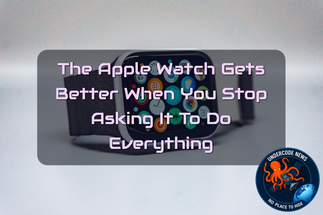
The Apple Watch has gradually become one of the most information-packed devices Apple makes. It can track workouts, monitor activity, display weather conditions, show health metrics, surface notifications, control music, provide directions, and keep dozens of complications within reach. Yet for many people, the best Apple Watch experience is not about seeing more. It is about seeing exactly what matters, and nothing else.
That philosophy is at the heart of a simple but surprisingly elegant Apple Watch setup built around the Modular Ultra face. While Apple has not introduced a completely new watch face with watchOS 27 so far, the existing Modular Ultra face still has enormous potential. Its strength is not simply how much information it can display, but how easily it can be stripped down into something calmer and more intentional.
For users who prefer technology that stays out of the way, this minimalist approach makes a compelling argument. The Apple Watch does not necessarily need to become a tiny dashboard packed with numbers. Sometimes a large clock, a couple of useful details, and plenty of empty space are enough.
The Philosophy Behind a Minimal Apple Watch Face
There is an understandable temptation to fill every available space on an Apple Watch face. Apple gives users complications for almost everything, so why leave any of them unused?
The answer is surprisingly simple: information has a cost.
Every complication competes for attention. Every notification creates another reason to look at the display. Every number invites interpretation. Over time, an Apple Watch that was supposed to make life easier can become another source of digital noise.
A restrained watch face takes the opposite approach. Instead of asking what information can be displayed, it asks what information actually deserves to be there.
That is where the minimalist interpretation of Modular Ultra becomes interesting.
Modular Ultra: A Face Built for Extremes
Modular Ultra is an Apple Watch face designed specifically for the Apple Watch Ultra lineup. It was created to take advantage of the larger display and the additional information that Ultra users might want during workouts, outdoor activities, and everyday use.
At its maximum configuration, Modular Ultra can look almost like a miniature command center.
It can accommodate several compact complications, a larger complication area, and additional bezel information. Depending on the configuration, users can expose data such as seconds, depth, elevation, and training-related metrics.
For athletes, hikers, divers, and people who genuinely need this information, that density can be extremely useful.
But there is another way to use the face.
Turning Modular Ultra Into Something Calmer
Instead of filling every available complication slot, the minimalist configuration deliberately leaves much of the face empty.
The central priority is the time itself. The clock remains large and easy to read, with seconds visible. On an Apple Watch Ultra 3, the always-on display makes this particularly appealing because the seconds remain visible even when the watch is not fully awake.
That small detail changes the character of the face.
Rather than turning the watch into a data panel, it makes it feel more like an exceptionally capable traditional watch.
Temperature Gets a Place in the Corner
One of the useful additions is current temperature, accompanied by the day’s low and high.
This is a good example of a complication earning its place because it answers a practical question quickly.
Do I need a jacket?
Is it getting warmer?
Will the temperature drop later?
The information is available without requiring a weather app or a swipe through another screen.
That is precisely what a good complication should accomplish.
Activity Rings Stay Within Reach
The upper-right complication is currently dedicated to Activity Rings.
That choice can change depending on the
This flexibility is one of the strengths of Apple’s complication system.
A watch face does not have to be permanently fixed. It can evolve with your routine.
Someone spending the day outdoors might prioritize UV Index. Someone training regularly might prefer activity data. Someone traveling could use another complication entirely.
Empty Spaces Are Not Wasted Spaces
Perhaps the most interesting part of this configuration is what is missing.
Four of the smaller complication slots remain completely blank.
That may sound strange on a face specifically designed to hold information, but the empty spaces create visual balance. Instead of forcing every corner to communicate something, the layout allows the clock to breathe.
Negative space is often treated as an absence.
Here, it becomes part of the design.
The result is a watch face that feels significantly less busy without abandoning the visual character that makes Modular Ultra distinctive.
Seeing the Full Power of Modular Ultra
The contrast becomes clearer when the face is configured to its full capacity.
A fully loaded Modular Ultra setup can display six compact complications, a medium complication underneath the clock, and additional bezel information.
The bezel itself can become a source of useful data, including seconds, depth, elevation, or training load.
This demonstrates why Modular Ultra remains one of the most flexible Apple Watch faces available.
It can be transformed from a nearly minimalist clock into a dense information hub without changing the underlying face.
More Information Does Not Always Mean More Utility
There is an important distinction between information density and usefulness.
A face containing ten pieces of information might technically provide more data than a face containing three. But if eight of those pieces are rarely relevant, the additional information can actually make the experience worse.
This is a broader lesson in interface design.
Technology is often celebrated for how much it can do. Mature technology should also be judged by how effectively it knows when not to do something.
The minimalist Modular Ultra configuration illustrates that principle particularly well.
The Strange Red Notification Dot
There is one small visual quirk that becomes noticeable when the face is configured this way.
The red notification indicator is positioned with the original complication architecture in mind. Because the upper area can accommodate another complication, the notification dot does not appear perfectly centered in this minimalist arrangement.
Ordinarily, that might be considered a design flaw.
Here, however, the imperfection almost becomes part of the appeal.
It makes the face look slightly unconventional, particularly because so much of the surrounding space is intentionally empty.
A Small Imperfection Can Add Character
Apple’s interfaces are usually known for precision.
Everything has a defined position. Spacing is carefully considered. Elements are aligned and standardized.
That makes the slightly unusual notification-dot placement stand out.
Instead of ruining the minimalist appearance, it gives the configuration a little personality.
Not every design choice has to disappear into perfection. Sometimes an unusual detail is what makes a particular setup feel personal.
The Bigger Lesson for Apple Watch Users
The popularity of complicated watch faces often comes from a reasonable desire to maximize the device.
After spending hundreds of dollars on a smartwatch, users naturally want to take advantage of everything it offers.
But maximizing capability does not necessarily mean maximizing visible information.
A better strategy may be to maximize relevance.
The best watch face is not the one that shows the most.
It is the one that shows the right things at the right time.
Why Minimalism Works So Well on a Smartwatch
A traditional watch has one primary job: tell the time.
The Apple Watch has hundreds of possible jobs.
That difference can make the screen feel overloaded.
A minimalist configuration brings the Apple Watch closer to the visual simplicity of a traditional timepiece while retaining modern functionality in the background.
You still have access to notifications, apps, health information, workouts, weather, and communication.
They simply do not have to occupy the main screen all the time.
The Apple Watch Ultra Does Not Have to Look Aggressive
Apple Watch Ultra models are visually distinctive. Their larger displays, rugged construction, and action-oriented features naturally encourage users to build equally aggressive watch faces.
But the hardware does not require a maximalist interface.
A clean Modular Ultra configuration can make the Ultra feel surprisingly understated.
The contrast is compelling: an extremely capable piece of hardware paired with an intentionally quiet interface.
The Case for Intentional Notifications
The same philosophy applies beyond complications.
Reducing unnecessary notifications can dramatically change how an Apple Watch feels throughout the day.
When every application is allowed to interrupt, the watch becomes another notification center.
When only important alerts remain, the device becomes more useful.
This is not about rejecting technology.
It is about controlling when technology gets your attention.
The Apple Watch as a Tool, Not a Distraction
That distinction matters because the Apple Watch sits directly on the wrist.
A phone can be placed in a pocket.
A computer can be closed.
A smartwatch is physically attached to you.
That makes restraint especially valuable.
A minimalist face can function almost like a visual boundary. The watch tells you what you deliberately chose to see, while everything else remains available when you intentionally seek it.
What Undercode Say:
The Real Value of Modular Ultra
The most interesting aspect of this Apple Watch setup is not the face itself.
It is the philosophy behind it.
Modular Ultra was designed to support enormous information density.
Yet its flexibility also allows users to deliberately reject that density.
That is an important distinction.
A powerful interface should not force users to expose every capability at once.
The best interfaces provide control over complexity.
Apple’s complication system has increasingly moved in that direction.
Users can decide which information deserves permanent visibility.
Everything else can remain one tap or swipe away.
Information Overload Is Becoming a Hardware Problem
Smartwatch design has reached an unusual point.
The hardware can display more information than most people need.
High-resolution displays, larger screens, faster processors, health sensors, GPS, cellular connectivity, and increasingly sophisticated software create an enormous amount of potential data.
But human attention has not expanded at the same rate.
That creates a mismatch.
The device becomes more capable while the
Minimalist watch faces are therefore not simply aesthetic choices.
They are a response to information overload.
The Clock Should Still Be the Star
There is something almost radical about making the time the most important thing on a smartwatch.
After years of adding functionality, the basic purpose of a watch can easily become secondary.
The large clock restores that hierarchy.
Everything else becomes supporting information.
That is a healthier design relationship for many users.
Empty Space Communicates Confidence
The blank complication slots also communicate something subtle.
The user does not need to prove that the watch is powerful.
The power is already there.
Leaving space empty suggests confidence in the device and in the user’s ability to access information when necessary.
It is similar to minimalist dashboard design in cars, clean desktop layouts, and simplified smartphone home screens.
Less visible complexity can make a sophisticated product feel easier to use.
Apple Could Take This Philosophy Further
There is also an opportunity for Apple.
Future versions of watchOS could offer more intelligent adaptive faces that automatically reduce visual complexity depending on context.
For example, a workout mode could expose training metrics.
A work mode could prioritize calendar information.
An outdoor mode could highlight weather and UV data.
A sleep or evening mode could reduce visual stimulation.
The underlying principle would remain the same.
The watch should show what matters now, not everything that might matter eventually.
watchOS 27 Has an Opportunity
The discussion becomes even more relevant as Apple continues evolving watchOS 27.
New watch faces and face updates are among the easiest ways Apple can change the personality of the Watch without changing the hardware.
A new face does not necessarily need more complications.
It could instead introduce better hierarchy, cleaner typography, smarter contextual information, or more meaningful use of negative space.
That could make the next generation of Apple Watch software feel more mature.
The Ultra 3 Changes the Equation
The always-on display capabilities of Apple Watch Ultra 3 make this particular setup even more attractive.
When seconds remain visible, the device can function almost like a precision timepiece rather than a miniature computer that constantly needs to wake up.
That is especially useful for people who care about exact timekeeping but do not want a cluttered interface.
Customization Is the Real Feature
Ultimately, the greatest strength of Modular Ultra may be customization itself.
One user can fill it with training metrics.
Another can use it for navigation.
Another can prioritize weather.
And another can deliberately leave most of it empty.
All four users are getting a different Apple Watch experience from the same face.
That is what meaningful customization should look like.
The Minimalist Approach Is Not for Everyone
There is no reason to pretend that a stripped-down face is objectively better.
For runners, cyclists, divers, hikers, and serious athletes, having multiple data points immediately visible can be extremely valuable.
The problem only appears when information is displayed because it can be displayed rather than because it is useful.
The right question is not whether a face is busy.
The right question is whether the busyness serves a purpose.
The Future of Smartwatches May Be Quieter
As smartwatches mature, the next stage may not involve adding more features.
It may involve better filtering.
Users already have access to enormous amounts of data.
What they increasingly need is intelligent prioritization.
The winning smartwatch may ultimately be the one that understands when to stay quiet.
Deep Analysis
Inspecting Apple Watch Configuration Philosophy
A minimalist approach can be understood using a simple Linux-style workflow for thinking about information density:
watch_config="Modular Ultra"
complications=2
empty_slots=4
echo "Primary focus: time"
echo "Visible complications: $complications"
echo "Unused slots: $empty_slots"
The important variable is not how many complications exist.
It is how many complications deserve attention.
Measuring Notification Noise
The same concept can be applied to notifications:
notifications=$(find ~/Notifications -type f 2>/dev/null | wc -l)
echo "Notification events: $notifications"
The practical lesson is simple: fewer interruptions can produce a cleaner relationship with the device.
Prioritizing Useful Data
A conceptual configuration might look like this:
priority=("time" "temperature" "activity")
for item in "${priority[@]}"; do
echo "Priority: $item"
done
This represents the core idea behind the minimalist face.
Choose priorities first.
Choose complications second.
Designing Around Human Attention
A useful design rule can be expressed as:
if [ "$information" -gt "$attention_capacity" ]; then
echo "Reduce visible information"
else
echo "Configuration is manageable"
fi
Smartwatch interfaces should ultimately be designed around human attention rather than hardware capability.
The Engineering Perspective
From an engineering standpoint, Modular Ultra is interesting because the same underlying interface supports radically different information densities.
That suggests a flexible rendering system rather than a rigid one.
Apple can therefore experiment with hierarchy and presentation without abandoning the fundamental face architecture.
The Product Strategy
For Apple, customization also creates product differentiation.
An Apple Watch Ultra owner does not necessarily need a completely different software ecosystem.
Instead, Apple can make the Ultra feel distinct through specialized complications, display behavior, bezel information, and configuration options.
That keeps the experience familiar while preserving a sense of exclusivity.
Accuracy Check
✅ The Modular Ultra watch face is designed for Apple Watch Ultra models and supports a high level of complication customization.
✅ The face can be configured with multiple complications and additional bezel information, making it suitable for both information-heavy and minimalist layouts.
❌ Claims about future watchOS 27 watch faces, leaks, or unreleased features should be treated separately from currently available functionality until Apple officially confirms them.
Prediction
(+1) Apple Watch Faces Will Become More Context-Aware
(+1) Apple is likely to continue expanding watch-face customization as watchOS evolves, with greater emphasis on personalized information.
More users will experiment with minimalist configurations.
Contextual complications could become more important than simply adding additional complication slots.
Apple may increasingly prioritize information hierarchy over raw information density.
Larger displays will give designers more room to create both dense and minimalist layouts.
The Apple Watch Ultra line will remain particularly well suited to users who want highly configurable faces.
A completely information-free smartwatch experience is unlikely to become Apple’s default direction.
Athletes and power users will continue demanding dense, specialized data displays.
Apple is unlikely to abandon complication-heavy faces because they remain valuable for advanced users.
Final Thoughts: The Best Apple Watch Face May Be the One You Barely Notice
The most compelling thing about this Modular Ultra configuration is how little it tries to do.
It keeps the time large.
It keeps a few genuinely useful pieces of information nearby.
It leaves room for the display to breathe.
And everything else remains available when needed.
That is a powerful reminder that smart technology does not always become better by becoming louder.
The Apple Watch can be a fitness tracker, communication device, weather station, navigation tool, health monitor, and miniature computer. But it can also simply be a watch.
For many users, that may be exactly what makes it better.
Sometimes the smartest Apple Watch setup is the one that gives you less to look at, so you can spend more time looking at what actually matters.
▶️ Related Video (82% Match):
🕵️📝Let’s dive deep and fact‑check.
🎓 Live Courses & Certifications:
Join Undercode Academy for Verified Certifications
🚀 Request a Custom Project:
Secure, high-velocity infrastructure and disruptive technological engineering. Contact our engineering team for high-tier development and proprietary systems:
[email protected]
💎 Smart Architecture | 🛡️ Secure by Design | ⭐ Trusted by Thousands
References:
Reported By: 9to5mac.com
Extra Source Hub (Possible Sources for article):
https://stackoverflow.com
Wikipedia
OpenAi & Undercode AI
Image Source:
Unsplash
Undercode AI DI v2
🔐JOIN OUR CYBER WORLD [ CVE News • HackMonitor • UndercodeNews ]
📢 Follow UndercodeNews & Stay Tuned:
𝕏 formerly Twitter 🐦 | @ Threads | 🔗 Linkedin | 🦋BlueSky | 🐘Mastodon | 📺Youtube


