
Listen to this Post
Introduction:
Apple’s attention to design detail is legendary — but sometimes, those very details ignite controversy among its most loyal fans. The recent macOS 26.1 beta 3 release proves that even the smallest icon can become the center of debate. After criticism over the original macOS Tahoe hard drive icon earlier this year, Apple appears to be quietly rolling out a redesigned version. The update, part of the new Liquid Glass aesthetic sweeping through iOS 26 and macOS 26, shows Apple’s willingness to listen to users — and its determination to keep refining its visual language.
The Story Behind Apple’s New macOS Icon
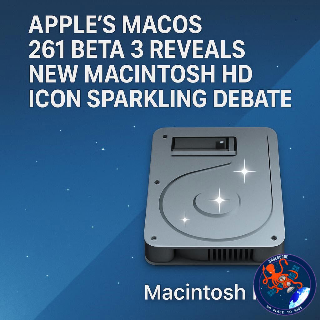
It turns out Apple TV isn’t the only new icon making waves in the latest OS updates. The spotlight has shifted to macOS Tahoe 26.1 beta 3, where Apple has introduced a subtle yet significant change: a redesigned Macintosh HD icon.
Earlier this summer, macOS Tahoe 26 debuted with the highly polished “Liquid Glass” design language, harmonizing the look across Apple’s ecosystem — from iOS to watchOS. As part of that shift, Apple unveiled a refreshed version of the Macintosh HD icon meant to reflect modern hardware. Instead of depicting the classic spinning hard drive of decades past, the new design aimed to represent the solid-state drives (SSDs) now found in every modern Mac.
But not everyone was impressed. Many users complained that the perspective and lighting didn’t feel right. The Apple logo appeared oddly angled, the shape of the drive felt inconsistent, and a mysterious port with tiny holes on the surface confused users. Some even said it looked more like an external SSD enclosure than an internal drive.
Still, the change symbolized Apple’s desire to modernize its UI assets, bridging nostalgia with present-day technology.
Now, in macOS 26.1 beta 3, Apple seems to have heard the criticism loud and clear. The newly unveiled Macintosh HD icon looks cleaner, more balanced, and visually aligned with the rest of the system icons under the Liquid Glass theme. The awkward port is gone, the perspective feels corrected, and the drive now mirrors the sleek, simplified design language that Apple has been refining across its platforms.
Is it better? For many, yes — but the debate remains open. Design, after all, is subjective, and Apple’s minimalist choices often divide opinions.
The company’s relentless pursuit of visual consistency often blurs the line between function and artistic identity. What began as a minor icon redesign has turned into a conversation about Apple’s evolving design philosophy. This latest tweak isn’t just about an image file — it’s about how Apple continues to reinterpret its legacy through the lens of modernity.
What Undercode Say:
Apple’s design updates, even those as small as an icon, carry immense symbolic weight. The Macintosh HD icon isn’t just a decorative element — it’s a visual representation of Apple’s core philosophy: merging nostalgia with innovation.
From a design psychology standpoint, Apple’s move makes perfect sense. The classic hard drive icon, once emblematic of the Mac’s identity, now feels outdated in an era where physical spinning drives are nearly extinct. By redesigning it to reflect an SSD, Apple acknowledges technological progress while preserving the familiar emotional cues long associated with macOS.
Yet, Apple’s design team walks a fine line. Every iteration of macOS has seen tension between skeuomorphism (designs mimicking real-world objects) and flat minimalism. The Liquid Glass aesthetic reintroduces dimensionality — reflections, depth, and gloss — without fully reverting to the hyper-realistic textures of early macOS icons. It’s Apple saying: we can honor the past without living in it.
The controversy surrounding this new icon is, ironically, proof that Apple’s visual identity still matters deeply to its users. Few other tech companies face public debate over a small graphic asset — and that’s because Apple’s audience sees design not as decoration but as culture. The Macintosh HD icon represents decades of computing heritage, the bridge between the tangible machines of the past and the digital clarity of today’s Apple.
What’s fascinating is how Apple’s icons serve as quiet storytellers. They evolve with the brand’s hardware — from the spinning disks of the early Power Macs to the silent speed of M-series silicon. This new redesign subtly reflects that transformation. The port removal? Likely intentional. It signifies the seamless, portless design direction of Apple’s hardware lineup.
There’s also a strategic layer. Each update, no matter how small, keeps users emotionally and visually engaged with the Apple ecosystem. A new icon isn’t just aesthetic — it’s a signal. It reminds users that macOS is alive, evolving, and responsive to feedback.
Critics argue Apple’s recent visual identity feels less “magical” than in the days of Aqua and brushed metal. But the Liquid Glass design could mark a middle ground: a revival of tactile beauty adapted for a cleaner, high-resolution era.
Apple’s iterative refinement reflects its culture of perfection — not through sweeping overhauls but through micro-adjustments that accumulate into cohesion. It’s a process similar to how Jony Ive once described design: not about making things different, but making them better.
Ultimately, this icon update is less about a drive symbol and more about Apple’s quiet dialogue with its audience. Through design, it communicates attentiveness — a willingness to adapt, even when the feedback concerns something as small as a corner shadow or a missing port. That humility, rare for a trillion-dollar company, might be Apple’s greatest design achievement yet.
Fact Checker Results:
✅ Apple did release macOS 26.1 beta 3 featuring a redesigned Macintosh HD icon.
✅ The new design reflects modern SSD-based Macs, aligning with the Liquid Glass aesthetic.
❌ Apple has not officially commented on user feedback or confirmed the reason for the redesign.
Prediction:
🖥️ Expect Apple to continue refining macOS iconography throughout 2025, aligning it even more closely with iOS and iPadOS design languages.
💡 Future updates may see icons adapt dynamically to system themes or hardware models.
🔮 Apple’s next evolution in design might reintroduce “material realism” — merging tactile depth with digital clarity to create the next chapter of its iconic visual story.
🕵️📝✔️Let’s dive deep and fact‑check.
References:
Reported By: 9to5mac.com
Extra Source Hub (Possible Sources for article):
https://www.reddit.com/r/AskReddit
Wikipedia
OpenAi & Undercode AI
Image Source:
Unsplash
Undercode AI DI v2
Bing
🔐JOIN OUR CYBER WORLD [ CVE News • HackMonitor • UndercodeNews ]
📢 Follow UndercodeNews & Stay Tuned:
𝕏 formerly Twitter 🐦 | @ Threads | 🔗 Linkedin | 🦋BlueSky | 🐘Mastodon


